Creating the Casa Otro Color Palette

This week, I'm collaborating with my good friend, Nathan Smith, an immensely talented artist, photographer, and entrepreneur. We're expanding the brand world of Casa Otro, his boutique b&b, artist residency, and gallery space in Old Mesilla, New Mexico. A project we've been working on together for over five years.
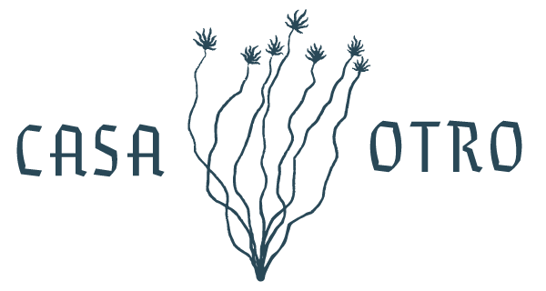
Nathan sketched an ocotillo plant on the property and sent it to me as a reference for a new brand mark. However, we both liked the original sketch so much that we opted to make it the foundation of our system. I added the blooms and built a modular system of framing elements and type lockups around it, allowing us to leverage the ocotillo in an assortment of applications (not pictured). I then created a color palette pulled directly from the “House of the Other’s” walls. We are leveraging the vibrant swatches of the interior courtyard, the rich colors of the Mexican tile, and the soothing tones of the nearly 200-year-old adobe walls.
It struck me as something between Warhol and Mattisse that neither of us intended to make but emerged out of the collaboration between the two of us and the property itself.
When creating a color palette, I build out quick color studies to dial in swatches and ensure an assortment of combinations can be leveraged. Upon doing so for Casa Otro and standing back, I suddenly felt like I was standing in a gallery and studying a beautiful modern painting. It struck me as something between Warhol and Mattisse that neither of us intended to make but emerged out of the collaboration between the two of us and the property itself. For me it represents another example of the magic of the creative process. It’s also a pretty good sign that we’re headed in the right direction with our brand updates.